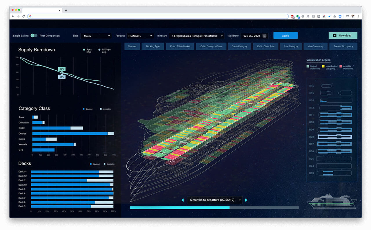
3D Model of Ship Inventory / Demand hot spots
Result: Built automated report to showcase where demand was concentrated across the fleet
Partners: Boost Labs
Understanding demand. The cruise business is complex, even the easy part which is simply selling staterooms. During one era, future sailings were under-performing for a new ship, but not every itinerary and it was difficult to determine why. Cut a long (long) story short, through Excel color-coding physical inventory based on their “demand” metrics revealed that blocks of inventory were not selling. In trying to understand why, I looked at how they were being merchandized online….and what-do-you-know, I couldn’t find them! Bit of a deep-dive later, we discovered some settings that were off-kilter, made the code-switch and Boom, inventory was showing as available back on the website.
While I admit I was down the rabbit hole, I saw this pattern occur frequently. It’s too nuanced to explain, but bottom line is that online merchandizing of inventory often relies on settings and Boolean logic, that can change automatically when new pricing strategies are deployed.
To speed up the identification of the issues, a more automated and visually revealing proto-type was built with my partners at Boost Labs – data visualization geniuses. Built in 3D with the fourth Dimension of time as an optional extra (by using a simple scrollbar) we were able to quickly pin-point “Hot Spots” where demand was lagging. This could often reveal issues created by settings.
Now the reason I called it the Billion Dollar Bogey, is that the outcome was a function of the process, and the process was flawed. Using real-world data, the impact was calculated to be $50K per sailing, which over 20 years (System / Web lifetime) means only 1,000 sailings per year needed to be affected for the impact to be $1 Billion.


